North American Plastics
Industry: Manufacturing and Distributing
Annual Revenue: $1 billion+
My Role: User Experience & Development Lead
Team Size: Three -- Me plus two researchers
Length of Project: 12 weeks
John James
UX/UI Designer
Industry: Manufacturing and Distributing
Annual Revenue: $1 billion+
My Role: User Experience & Development Lead
Team Size: Three -- Me plus two researchers
Length of Project: 12 weeks
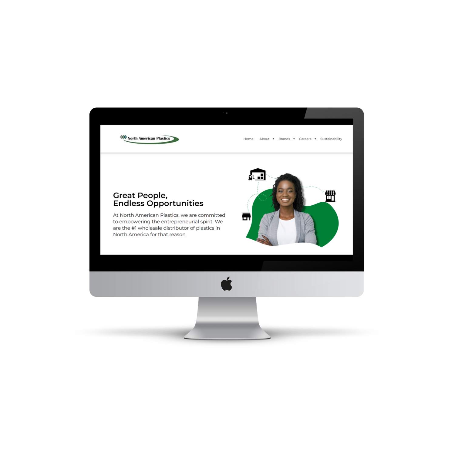
North American Plastics, the number one distributor of wholesale plastics in the US and Canada, needed a corporate site makeover. Their previous site was poorly made, without the user in the forefront of design decisions. Information was difficult to find, the appearance was outdated and their digital presence didn't match their in-person reputation. I wanted to change that through intentional, user-focused design.
On most plastics companies sites, they a have tons of pictures of plastic, but none of actual people. The lack of human presence on the websites made for a drab and uniform look across plastic companies. I wanted to change the narrative by highlighting the people within the company. As recruitment efforts ramped up and future acquisitions were pending, highlighting a human presence on the site to increase engagement and personability was essential. The CEO expressed to me that he didn't want to just look like another "corporate" site. He wanted NAP to feel like a fun place to work and a great company to work with.


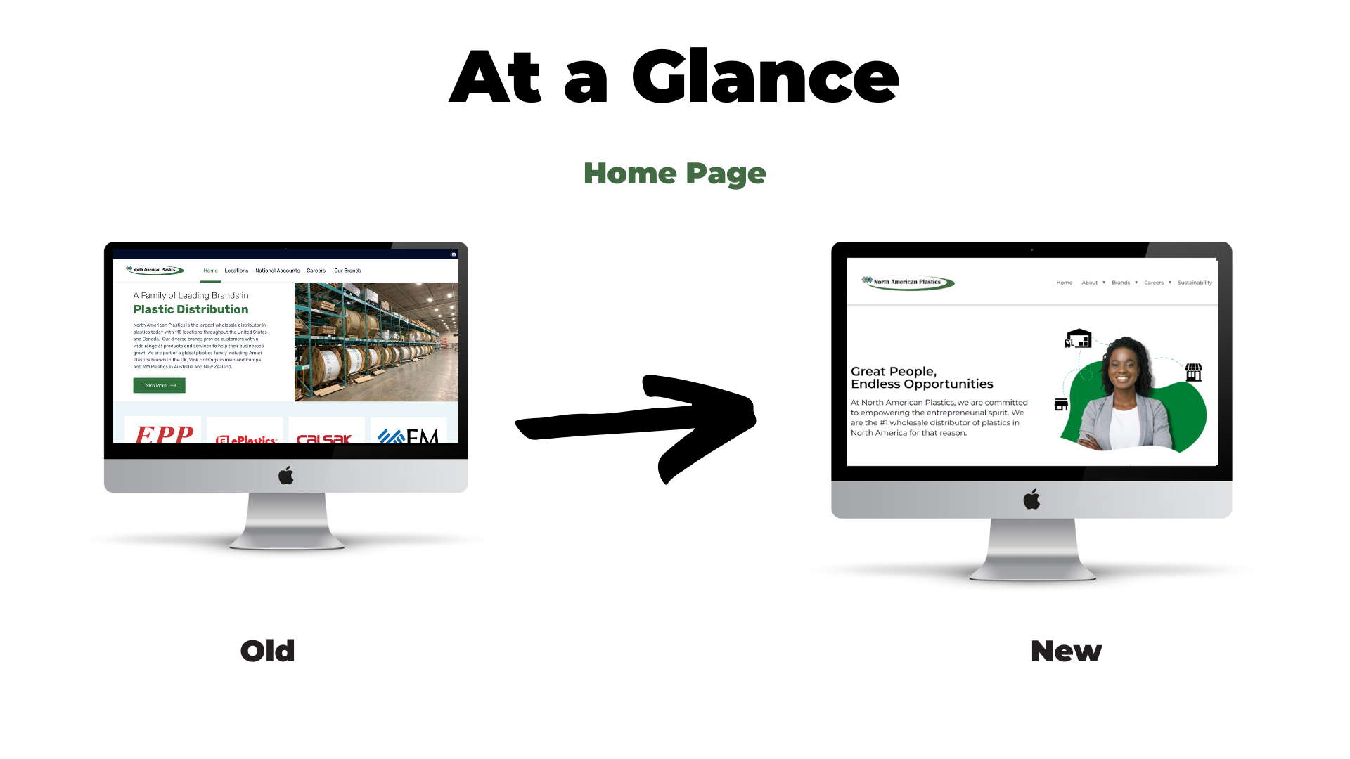
Screenshot from their old home page...not very appealing, plus cognitive overload. It didn't do their business justice.
Despite being the number one wholesale distributor of plastic, they're not very popular. Their web presence definitely did not show them as the leader in the industry due to the unjustified design decisions and outdated look. I wanted to truly make them look like the number one plastics distributor through their web presence, and not just their sales numbers. I led with the idea that the top plastics company in the US should have the top plastics site in the US.
I served as the UX lead on this project, but I was also responsible for developing the site. I initially wanted to use React JS to build the site, but since we would not have any addition developer support, I decided to go with Wordpress to simplify future editing. Also, as the only UX Designer, I didn't have anyone else to bounce ideas off of, but I was able to do some competitive analysis and utilize research from our researchers to create a clean, usable product.
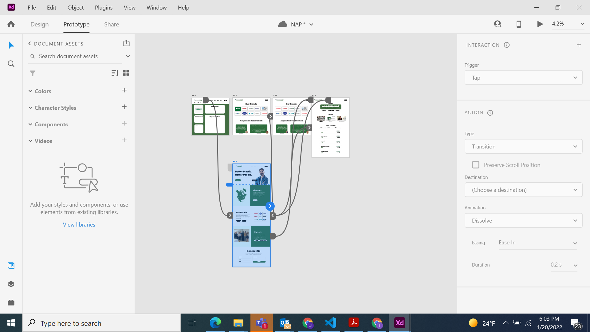
Initial prototype in Adobe XD

I was determined to accomplish three key goals: (1) Give the site a modern, clean look by using best-in-industry design practices. (2)Replace pictures of plastic with people because the corporate site wasn't a sales site, and users wanted to know more about the people at the company, not the plastic. (3)Make information easy to find through intentional information architecture and hierarchy.
I started off by interview executives and users to see what they valued in a corporate site. A few main aspects were, "a good place to work", "a great company to be acquired by" or "a great company to work with". I also completed a competitive analysis to see what competitor's were doing on their site, what worked and what fell short. I then created a sitemap, mockup and prototype with Adobe XD to complete user testing. After applying the user feedback, I created the final design and we went live. Since then, we've used user feedback to make multiple improvements to the site.
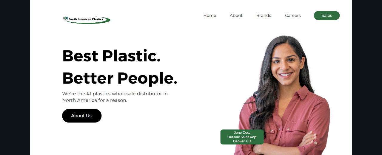
Initial mockup of the site I presented to the CEO and employee development specialist.
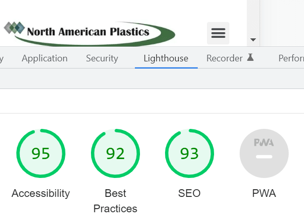
SEO, Accessibility and Best Practices are high!